
How Color Coordination Works - and Why Most People Overcomplicate It
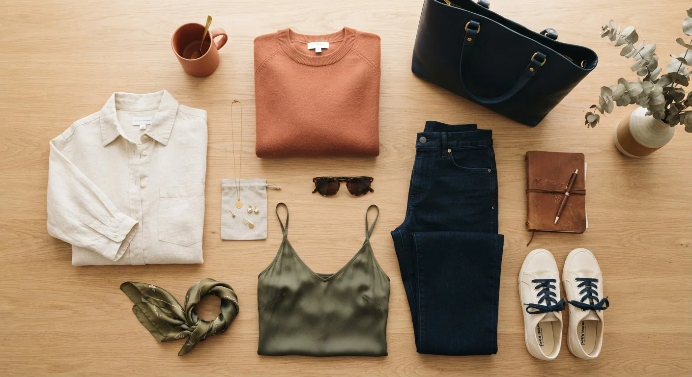
Photo credit: TurboBlogs.net | Explore Blogs At Turbo Speed
In this article
Understand the foundational principles behind pairing colors in outfits, with clear explanations that make everyday dressing easier.
Key Takeaways
- Color coordination follows simple, learnable patterns - not talent or instinct.
- Three core relationships - neutral, analogous, and complementary - cover most everyday outfits.
- Anchoring an outfit in neutral tones makes adding color much easier and more forgiving.
- Skin tone can influence which hues feel most flattering, but there are no universal rules.
- Simplicity and consistency beat complicated color schemes every time.
The Real Reason Color Feels Confusing
Most people aren't bad at color - they're just overloaded with contradictory advice. Fashion content often presents color coordination as an innate gift: either you have an eye for it or you don't. That framing is both discouraging and wrong.
Color coordination is a skill built on a small set of repeatable principles. Once you understand the logic behind why certain colors work together, the decisions get dramatically easier. The goal isn't to memorize a color wheel - it's to build enough intuition that getting dressed feels natural rather than stressful.
If you're also thinking about simplifying the clothes you work with, our Capsule Wardrobe guide explains how a smaller, intentional closet makes color decisions easier by default.
The Three Core Color Relationships
Nearly every outfit that looks put-together relies on one of three basic color relationships:
- Neutral combinations: Pairing colors like white, black, grey, navy, beige, or camel with each other or with any other color. Neutral palettes are forgiving, professional, and endlessly versatile.
- Analogous combinations: Using colors that sit next to each other on the color wheel - like olive green with mustard yellow, or dusty blue with lavender. These pairings feel calm and cohesive because the colors share underlying tones.
- Complementary combinations: Pairing colors from opposite sides of the wheel - think rust orange with cobalt blue, or burgundy with forest green. When done with one dominant color and one accent, this creates a visually energetic but balanced look.
You don't need to rotate between all three. Many people find one approach that suits their lifestyle and stick with it - there's no rule that says you must use complementary colors if analogous palettes feel more natural to you.
62%
Shoppers who cite color as top purchase driver
According to research published by the Pantone Color Institute, color is cited by a majority of consumers as a primary reason for choosing one product over another.
90 sec
Time to form a color-based impression
Studies on consumer perception suggest that people form initial judgments about products and outfits within 90 seconds, with color accounting for the majority of that impression.
3
Max colors in most cohesive everyday outfits
Style educators and color consultants broadly agree that limiting an outfit to three visible color zones produces the most consistently polished results.
How to Build an Outfit Color Foundation
The most reliable method for everyday dressing is the anchor-and-accent approach: start with one or two neutral pieces as your foundation, then introduce color through a third item - a top, scarf, or shoe.
This works because neutrals act as visual breathing room. They allow the eye to settle on the accent color rather than being pulled in multiple directions at once. It's also highly adaptable: swapping the accent piece completely changes the mood of the outfit without rebuilding from scratch.
Start With What You Already Own
Before buying anything new, lay out the clothes you already have and experiment with combinations using the anchor-and-accent method. You may discover pairings you've never tried simply because you've never looked at pieces side by side. Most people have more workable combinations than they realize.
Once this feels intuitive, you can layer complexity - two neutrals and two complementary accents, for example - but most everyday outfits don't need to go further than the anchor-and-accent model to look deliberate and stylish.
For a practical look at building this kind of wardrobe without overspending, see our guide to building a versatile wardrobe on a budget.
Skin Tone, Contrast, and Personal Preference
You'll often hear that your skin's undertone - warm (golden, olive) or cool (pink, bluish) - should determine your color palette. There's some logic here: colors with similar undertones can create a harmonious effect against your skin. Warm undertones often feel comfortable alongside earthy tones like terracotta and camel; cool undertones may feel fresh next to jewel tones like sapphire or emerald.
But this is a starting point, not a rulebook. Personal preference, lighting, and the specific shade of a color all matter. If a color makes you feel confident when you wear it, that confidence reads in how you carry yourself - which is its own form of coordination.
“Color is a power which directly influences the soul. It is complementary to form, and, like music, it can stir emotions without the mediation of ideas.”
— Wassily Kandinsky, Painter and art theorist, author of 'Concerning the Spiritual in Art'
The same logic applies to contrast: some people naturally gravitate toward high-contrast outfits (dark and light pairings), while others prefer low-contrast tonal looks. Both are valid, and both follow color coordination principles - just different ones.
For more on how body proportions and personal style interact, our piece on dressing for your body shape separates research from myth.
Making It Work in Real Life
Knowing the theory is useful; applying it under time pressure on a Tuesday morning is the actual test. A few habits that bridge the gap:
- Plan combinations in advance. Lay out a week's worth of outfits on the weekend. This removes in-the-moment decision fatigue and surfaces gaps in your wardrobe you might not have noticed.
- Test combinations in natural light. Colors look different under artificial lighting. If something feels off when you step outside, that's worth noting for next time.
- Use the rule of three. Most outfits that feel cohesive use no more than three distinct colors. Two neutrals and one accent, or one neutral and two analogous tones - both follow this pattern naturally.
If you want to expand these habits into a full personal style framework, our starter guide to personal style is a practical next step - especially if you find shopping more chore than joy.
Frequently Asked Questions

Author
Lifestyle & Shopping Editorial Team
Lifestyle & Shopping Editorial Team is the collective byline for our editorial team and contributor network. Articles published under this byline or an editorial pen name are researched, written, and reviewed according to our editorial standards for clarity, consistency, and independence before publication.
View all articles →